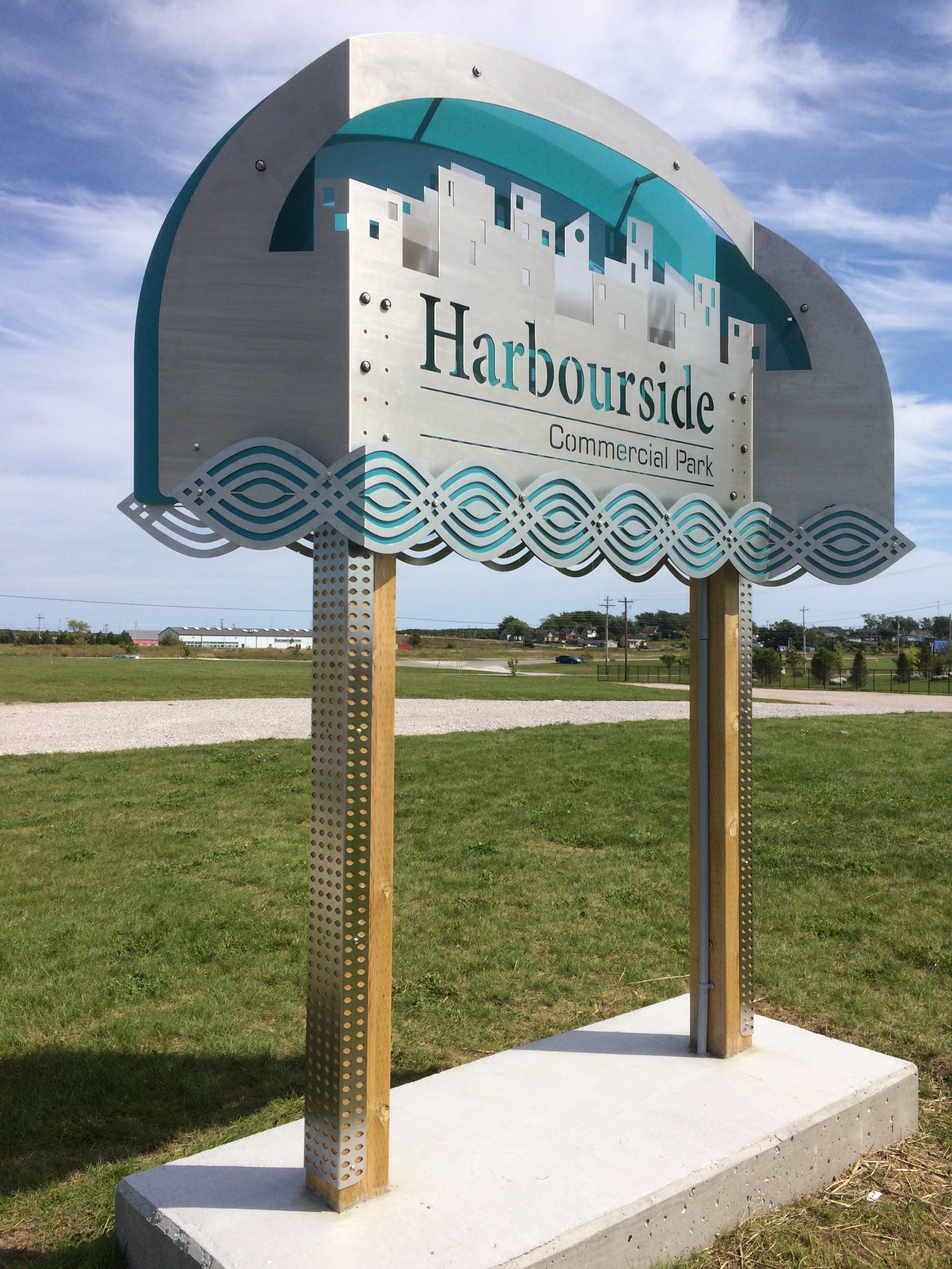
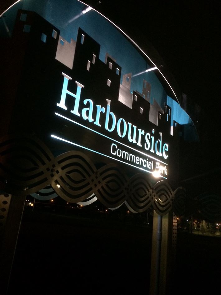
Is it a sign or is it art? New lighted sign at Harbourside

Harbourside Commercial Park, in the heart of Open Hearth Park, is home to several successful local businesses.  To help identify where the public park ends and the commercial park begins, BrandMetal  in Sydney was commissioned by Nova Scotia Lands to create a unique sign that suited the modern and industrial style of the area.

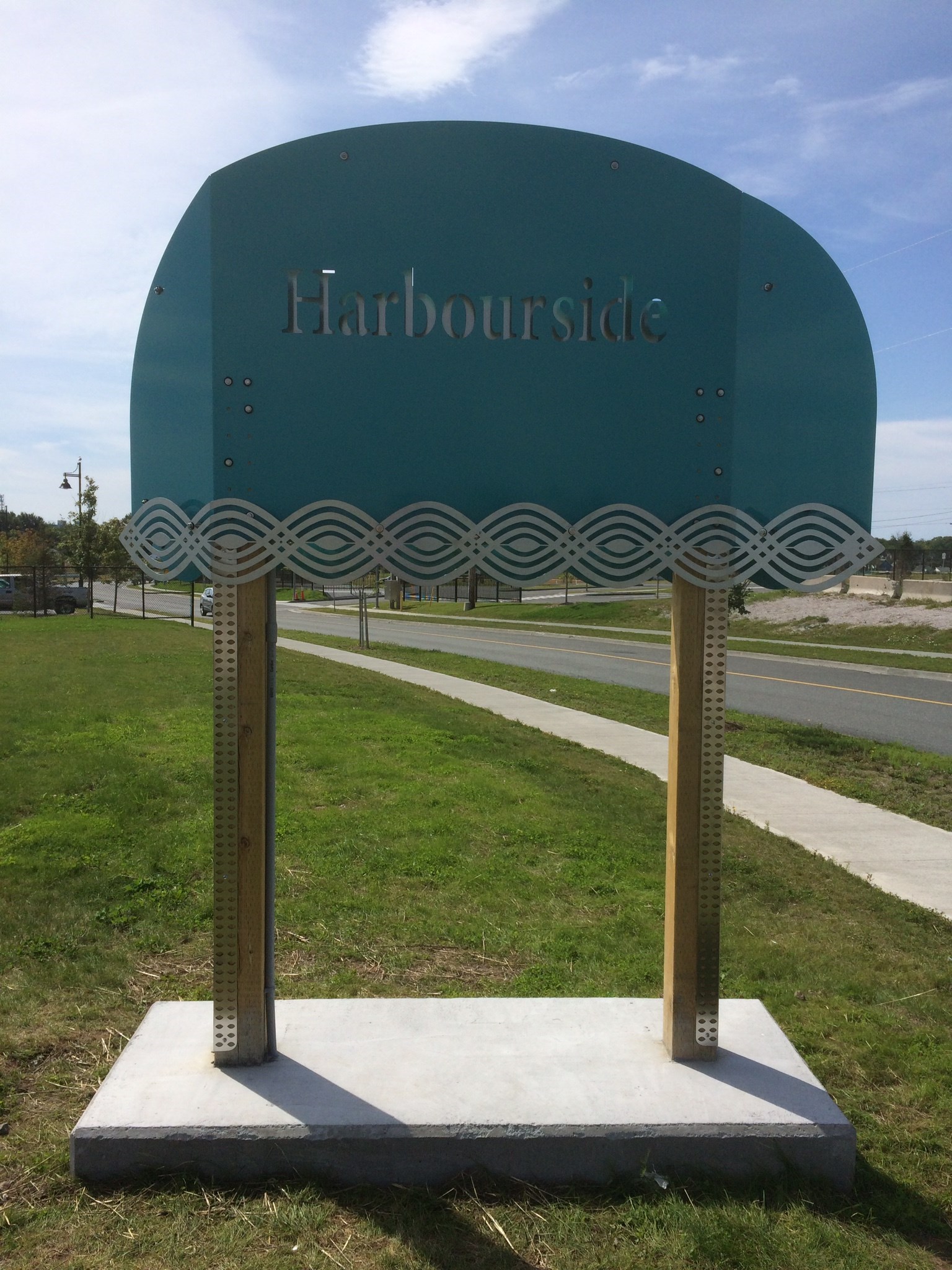
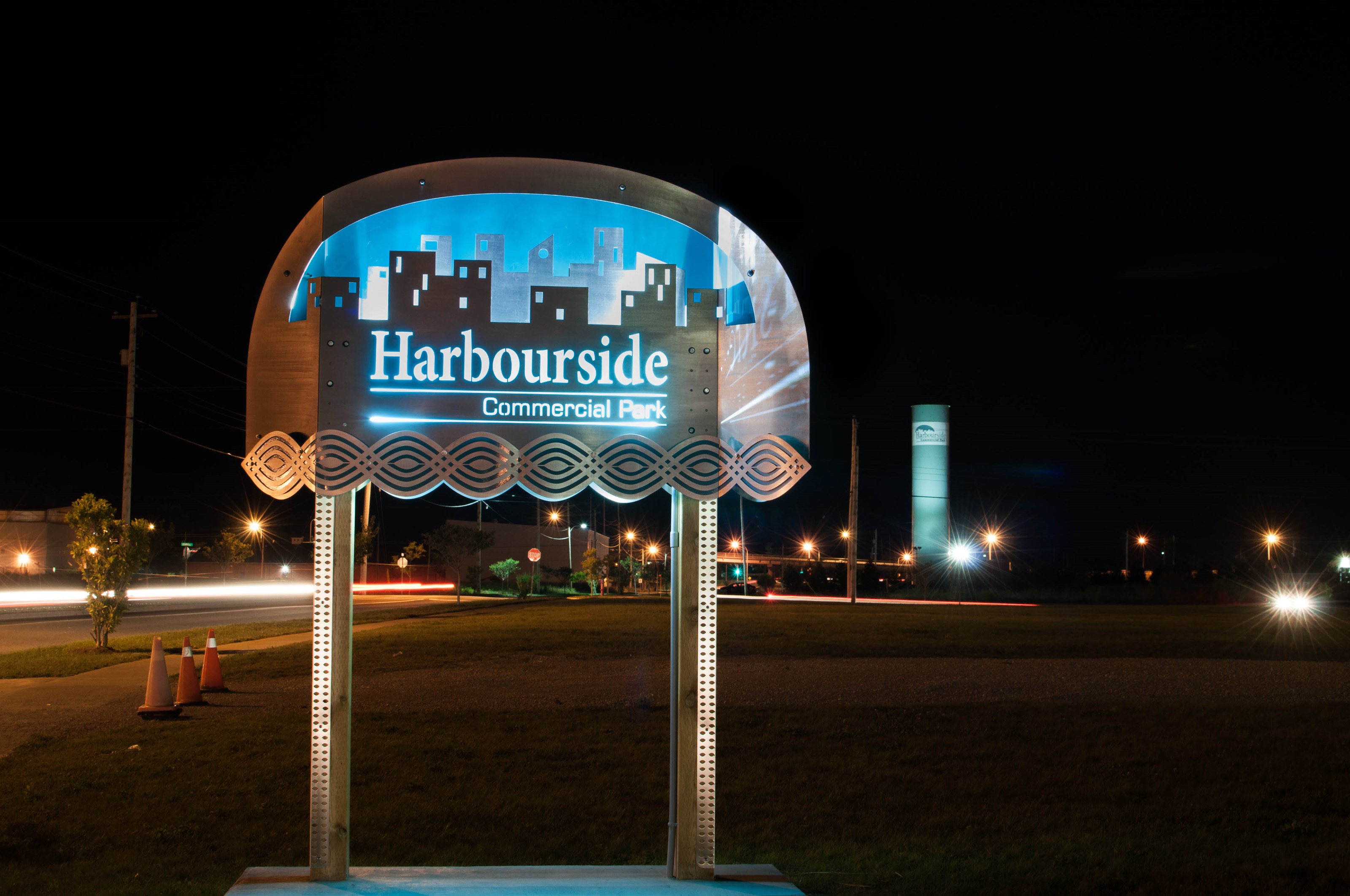
The result is what can best be described as "art-signage".  Check out the photos below.  

The art-sign is made of stainless steel with multiple layers of design elements that create dimension and visual interest, particularly when illuminated at night.  It is also double sided. 

By sharing our story, our hope is that it will inspire others in our community to take that extra effort to do something unique in our indoor and outdoor spaces. Cape Breton Island is naturally beautiful so why not try to make our man-made additions equally interesting?

See the sign at Open Hearth Park in Sydney, NS on the east side of the playground - see map (sidebar).
The original logo that was used to inspire the design. 
See more unique BrandMetal signage and art made right here in Cape Breton at www.BrandMetal.com and on Facebook

Posted by
Receive news by email and share your news and events for free on goCapeBreton.com
SHOW ME HOW


2,020 6
https://capebreton.lokol.me/is-it-a-sign-or-is-it-art--new-lighted-sign-at-harbourside
A&E Architecture & Interior Design Business News

6

Log In or Sign Up to add a comment.
Depth
James MacKinnon Follow Me
I wish other businesses and organizations in CBRM put the same kind of thought into their outdoor signs. The first eyesores to pop up were the high contrast LED signs, with gaudy primary colors bright enough to guide air tragic. Recently, local radio stations and other businesses have lined curbs with cheap plastic signs on thin metal dowels that go from advertisement to road-side litter as soon as a strong wind blows. These poorly thought out (and just plain ugly) marketing material is the visual equivalent of plastering email spam around town. Instead of assaulting my senses and ruining the fine visuals of the municipality, take a bit of time like Harborside did to promote their brand without corrupting the surroundings.
Peter Sheehan Follow Me
You don't get away with signs like that( the Led and those ugly florescent lettered signs on wheels) in Freeport , Maine , the home of LLBEAN . Even MacDonalds could not have their golden arches as it did not adhere to the towns by laws about exterior architecture and signage . Sydney talks about the downtown , but drive Kings Road and Prince street to really see an image and street scape problem.
[comment deleted] Posted
David Williams Follow Me
Amazing work. Just amazing!
Glen Moffatt Follow Me
That is a beautiful piece of signage/artwork! I need to drive by there at night to check it out soon- great work!
Peter Sheehan Follow Me
That sign has amazing graphics and colours . Need a sign like that to welcome people to Cape Breton !!!!!
[comment deleted] Posted
Lynn Hussey Follow Me
Beautiful! Well done and I agree more updated eye catching signs would be awesome.

Facebook Comments

View all the LATEST
and HOTTEST posts
View

Share this comment by copying the direct link.

  • Our Sponsors

Using this website is subject to the Terms of Use that contain binding contractual terms.