
.jpg?preset=avatar-80 "Rory Andrews")
The Good, The Bad, and The Cape Breton.
![]()

![]()
I don't know who hoisted the first flag, or how the rest of the tribe reacted to Ukchok tying a dead squirrel to a stick and saying "This us now!" It must have been strange for invading armies to see one lunatic on the battlefield waving a piece of fabric around at nobody in particular. Maybe they just thought he was crazy and left him alone like the D-Day bagpiper. Maybe they ran him through with a sword. I have no idea. I'm not an historian. That's what my girlfriend does. I just like flags, like, a lot, and it's a great time to like flags, because absolutely everybody has a flag now.
![]()
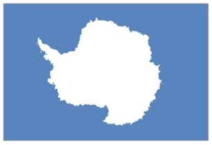
The official flag of Antarctica. Also seconds as a map of Antarctica. Also kind of looks like a laughing rhino.
![]()
And if you're thinking to yourself "Nobody even lives in Antarctica" or "Antarctica isn't even a country," we can go one more step down this uninhabited rabbit hole.
![]()
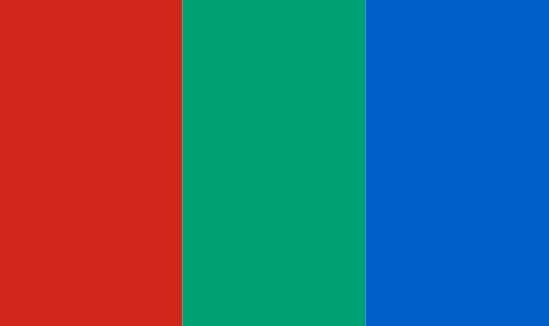
The flag of Mars, or a really boring rainbow.
![]()
Where Antarctica is barely habitable, it still holds around 66 research bases with a summer population of about 4,000 (mostly consisting of researchers and I'm guessing a few janitors), Mars is completely and utterly unlivable, and really, really far away. Remember that time you wanted to change the channel, but the remote was on the far end of the coffee table, so you just lied on the couch and watched the first and only episode of Private Practice in your life? Yeah, well multiply that by about a billion, and that's how far Mars is away. And you would die. And they have a flag, for no real reason. At least Antarctica had that guy who took out his own appendix. I'd give them a flag for that.
![]()
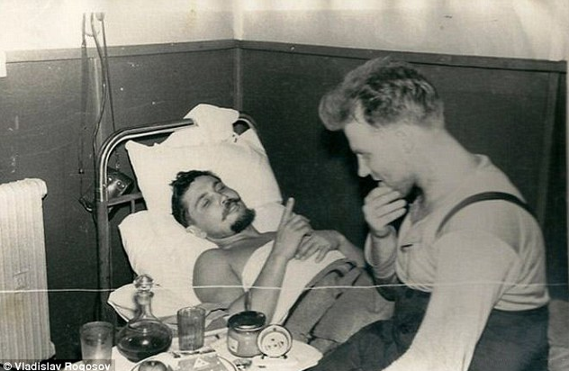
Leonid Rogozov recovering from his unexpected bout of being a total badass. They really should have found a way to include that facial hair into the flag design.
![]()
And why not? Flags are fun! And it got me thinking about the flags around here. I sure see a lot of flags around Cape Breton, but for as much as I know about flags and flag design, I sure don't know much about all the flags wafting around the front yards of this island. Do we have an official flag? Do we have five? Are they awful? I have no idea. But first...
What Makes a Good Flag
If you are ever given the rare and fortunate opportunity to design a flag, remember how people are going to see it. This is not hung in a museum or displayed on a widescreen teleprompter. Flags are 50 yards away, wafting in the wind, and most of the time hardly payed attention to. So draw your design small. I'm talking about a 1 x 1.5 inch rectangle on a piece of paper. If it doesn't work in that space, it doesn't work as a flag. So here's 5 simple rules on creating your very own flag.
![]()
Rule #1: Keep it Simple
![]()
Kill it with FIRE!
![]()
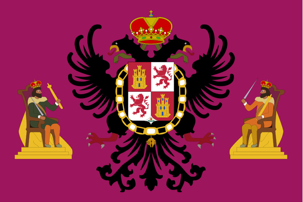
The official flag of Toledo, Spain has everything, including too much! I can't seem to figure out if this is a flag or an early attempt at the first metal cover-art ever. Are they fighting the two headed tongue bird? Are they teaching it to roll over? Does Toledo have two kings, and do their thrones have capes? I have to give them props on the use of the color mulberry on their flag though. Don't see that often.
Just imagine if you were in 6th grade and your teacher asked you to draw this flag. I would have probably thrown something at them because I was an insolent punk of a 6th grader. 50 stars was hard enough.
![]()
Conclusion: Turn down your flag Toledo. It's hurting my eyes.
Rule #2: Meaningful Symbolism
![]()
Two Bears holding up a picture with another bear on it. Three bears... Bears.
![]()
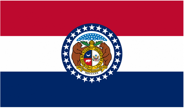
This is the state flag of Missouri, and if I were going strictly from the flag, I would have no indication that actual humans live there. If I knew nothing about Missouri except for this flag, I would think the state to be a long-lost, hyper-advanced, patriotic bear colony, with a thriving bear government and bear economy. "United We Stand, Divided We Fall" sure sounds like the battle-cry of the bear revolution. Also, is the bottom of the gold seal a belt buckle? That sure looks like a belt buckle. Somebody have California call Missouri and let them know they're two over their bear limit.
![]()
At least they're not militant, like advanced Russian bears...
![]()
We're all doomed.
![]()
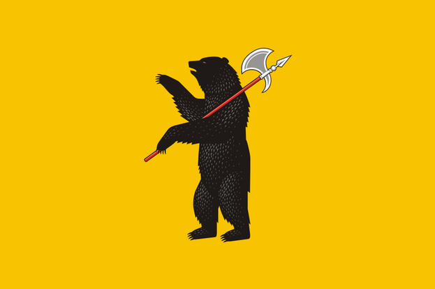
That's the flag of Yaroslavl Oblast, Russia, and honestly, I wouldn't be surprised if Russia had halberd wielding bears, because Russia. I actually had to look into the bear thing on the Missouri flag. The colors represent their French heritage, but there wasn't one mention of bears in my 5 minutes of researching that one Wikipedia article. I'm sticking to my underground bear conspiracy.
![]()
Conclusion: Bears
Rule #3: Use Two to Three Basic Colors
![]()
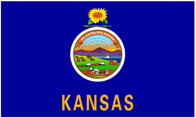
Kansas got flag design confused with a "Count the Mammals" scavenger hunt.
![]()
Seriously Kansas, a gradient sunset? Are you looking to spend your whole allowance at the flag printers? Your state flag looks like a screen grab from Oregon Trail. I'm glad you're being inclusive by having three different colors of horses, but was that really necessary? You could have honestly glued a Polaroid to a piece of cloth and got the same result.
Conclusion: Windows 95 Wallpaper
Rule #4: Be Distinctive
![]()
Pop quiz hot shot. What flag is this?
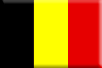
If you said "one of the stripey ones" you'd be correct!
![]()
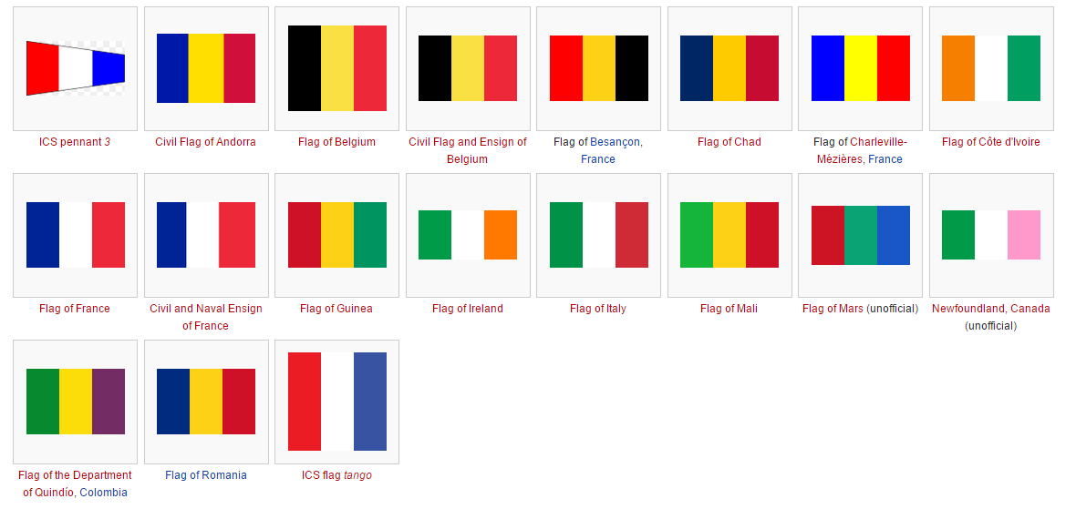
That is the flag of Belgium, and if you knew that, you're either Belgian or smarter than me. Was there 200 years of European history where everyone decided to just "phone it in?" Look at all of these.
![]()
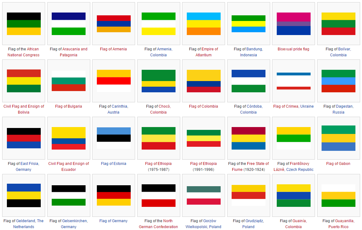
It's as if half the world procrastinated on their flag assignments, found some crayolas during break, shrugged their shoulders and copied the Dutch. Hats off to the "Free State of Flume" though, for being the most fictional-sounding real place ever.
"What about those up and down ones?" you ask? Well they're here too!
![]()
The unofficial flag of Newfoundland makes it look like the Easter Bunny lives there. I like it. And if you need any more reasons on why your flag should be distinctive take a look at the flags of Indonesia, Monaco, and Poland.
![]()
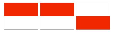
One of them should probably add a bear or something.
Conclusion: Monaco and Indonesia are playing Flag Chicken.
![]()
Rule #5: No Writing or Seals
![]()
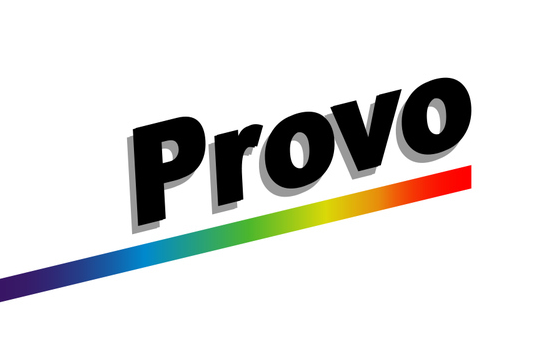
Rule #6: Don't be Provo, Utah.
Rule #7: Don't design your flag in Microsoft Paint.
![]()
Just in case you didn't catch it, that's Provo, Utah's actual Flag. That is not a logo for the Provo line of Canon printers. Someone needs to get fired.
![]()
People don't want to read. Why do you think I use so many pictures? I know people only skim my articles and read the picture captions. I'm totally OK with that... It doesn't hurt my feelings at all, I guess. This goes back to the fact that a flag is high, flapping in the wind, and generally not payed attention to. Although this seems like a simple rule, it is broken time and time again.
![]()
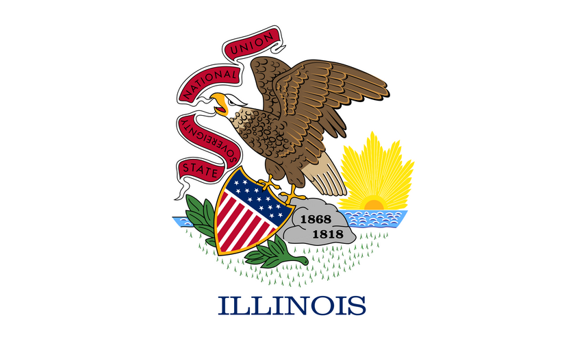
I'm going to give Illinois the benefit of the doubt here, and say "Sovereignty" is upside down because everyone got drunk, including that eagle.
![]()
Did you know Illinois was born in 1818, and died in 1868? I had no idea we were dealing with ghost Illinois this whole time. Does that mean America has a ghost president? This flag leads to way more questions than answers.
Conclusion: Don't be Provo, Utah
Update: Provo, Utah as of 2015 has a new official city flag, and here it is.
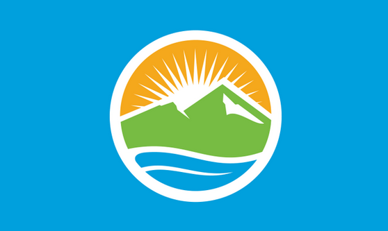
And besides looking like the seal of the Utah State Lottery, it's pretty good.
So now that we know the 5 simple rules on making a compelling flag, and before we get to some more local, Cape Breton examples, I would like to share with you some examples of
![]()
Good Flags
![]()
![]()
......Oh.....oh no....
![]()
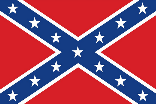
Hmm, it just got really awkward in here didn't it. Yeesh. But, ok, just bear with me now. Let's have a little thought experiment, shall we! Just for a little while, let's pretend that this flag did not belong to a failed insurrection within the United States for the right to own humans, and that this flag was not used as a KKK banner for 100 years, and just for kicks, lets imagine that a large portion of the South didn't JUST figure all of that out last week. I know it's a lot to handle, but clear your mind, and look at that flag. It's actually a really great design.
Three bold, bright colors, with clear distinction. No text. Unique. Instantly recognizable. Meaningful symbolism, and it even pays homage to it's American roots while still standing out on it's own. It's everything you want in a flag, except absolutely everything it stands for. Let's try a less volatile example, shall we? ![]()
Excellent! An equal opportunity murderer and slave trader!
![]()
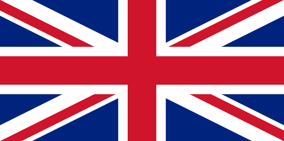
See, this is OK because England enslaved and killed everybody. It's difficult to even think of a race or culture that wasn't abused by the British Empire. They loved this flag so much, they planted it everywhere, then sold opium. It's honestly brilliant that England took three boring flags, and with their powers combined, created one of the coolest and most recognizable symbols in the world. It's like the Captain Planet of flags. The Union Jack is still on tons of flags around the world. Even Hawaii, and America fought two wars against the empire. I wonder why Whales doesn't have their flag in there somewhere? Maybe because nobody cares about Whales, not even enough to spell it right.
At this point, I know what you're wondering. "But Rory, what's the best flag?" I know you're thinking that because my opinion is very important and should factor into all your major life decisions. So here it is. The best flag.
![]()
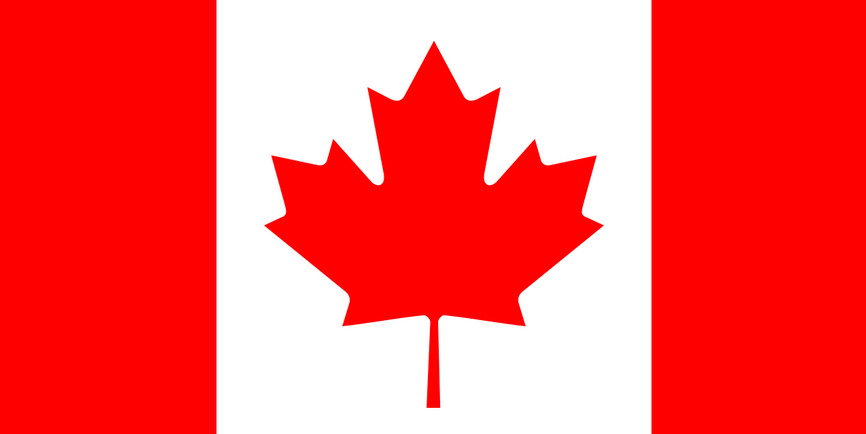
Canada Flag is Best Flag~!
![]()
It's the best flag. It really is. That is quality branding, a simple color palette, and the most unique design of any country on the planet without looking idiotic. What kind of county was this when the government could say "Ok everybody, the new symbol of our country is a leaf that dies every year, falls on your lawn, and kills your grass." Was a syrup bottle too hard to draw? It seems bonkers to me that it wouldn't cause a riot, but in hindsight, it was genius. You can put that leaf on absolutely anything to increase it's Canadianness by 1000%. You pretty much have to put the entire American flag on something to drive your point home, but for us, all you need is that 11 pointed leaf and you're a patriot.
And lets compare stars to leaves. Leaves are solar powered. They're green, most of the time. They protect us from the deadly radiation of the sun. Stars are giant balls of constant nuclear explosions. Pretty violent stuff, don't you think America?
What about Cape Breton Flags?![]()
Thanks for bearing with me everybody (I had to). You made it. Alright. Let's get local. We'll start with this one.
![]()
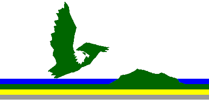
Looking down at the rest of the world, like the jerks that we are!
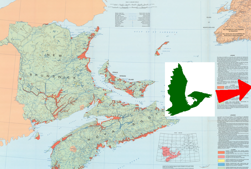
Did you know this is the official flag of Cape Breton Island? I mean, I've seen it around. Not much. But I didn't think it was official. Don't believe me? Check out the World Atlas. The flag was designed by Kelly Gooding and officially adopted in 1994. I've been telling people about this being our official flag, and a lot of people are surprised. I actually really like this flag, and here's one reason why.
![]()
See Ya! I'm gonna go hang with Iceland and become island nation bros!
![]()
Nothing says "island mentality" like Cape Breton literally taking flight and soaring away from the rest of Canada. I love it. I love it so much I brought my wicked MS Paint skillz to the table to show you.
It's also simple in it's design, and the eagle being the shape of Cape Breton is actually really clever, and we have eagles (not like that creepy, two-headed nightmare, Toledo). The flag even finds a way to includes our topography, which is unusual for a flag to do, except for Provo, now that I think about it.
I do have one issue with this flag though. As much as I like the "island = eagle" symbolism, it doesn't really look like an actual flag. It looks like an art project. And what's the gold band doing there? Is there gold here, and nobody told me about it?
Conclusion: B+
And if you thought that "other" flag was our official flag, here it is.
![]()
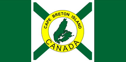
The island in the middle is a symbol of Cape Breton Island, and the words "Cape Breton Island" is another symbol for Cape Breton Island.
![]()
You might have already caught my issue with this flag. It's so incredibly literal. I can see the council meeting going on right now.
"It's a flag of the island. It should have the island on it!"
"Good idea Glen!"
"Also, it's called Cape Breton Island, so we should put that on the flag too!"
"Amazing idea Glen!"
"Furthermore, Cape Breton is in Canada, and everyone should be constantly reminded of that!"
"I love you Glen."![]()
And the word "Canada" is bigger than any other word on there. You know I like Canada, but I'm pretty sure the font size was just a matter of how big the words were. They got the color scheme right, but it all goes haywire once you get to the middle.
![]()
Conclusion: C+. Good job Glen!
![]()
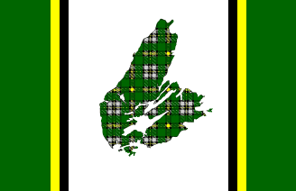
No! No. No tartan.
![]()
I see what you were going for. I really do. But no. No tartan on flags. Never ever ever. Tartan goes on kilts and skirts and shirts and bagpipes, but not on flags. You know what a tartan island on a flag wafting in the wind at 50 yards looks like? An unfortunate cat stain on your new linens. Was this flag invented by optometrists to increase walk-ins? This looks like a Photoshop experiment someone did for their Geocities webpage in 2004. Did I mention I don't like this flag? Well, I don't.
![]()
Conclusion: D, out of pure sympathy. ![]()
Ok, last flag. I promise.
![]()
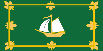
I told you the Maple Leafs were brilliant. (The design. Not the hockey team)
I saw this flag waving in Open Hearth Park, and I didn't know what to make of it. I didn't know what to make of it because it is THE BEST. Why is it the best? Because I've never seen more boats in front yards than any other place in the world besides the CBRM. Is that boat in blue? Nope. That boat's in green. Some guy is working on his schooner in between lobster seasons, and this flag says everything you need to tell you that.
![]()
But really, simple colour scheme. recognizable symbols, hearkening back to our royal shipping roots. This is a really great design, and my personal favorite of the flags around here.
Conclusion: +A for boats on grass!
![]()
So what do you think. Are you happy with the various flags we have flying around town?
If you would like to know more about Flags and Vexillology, check out Roman Mars podcast about the San Francisco flag here.


10
Log In or Sign Up to add a comment.- 1
arrow-eseek-e1 - 6 of 6 itemsFacebook Comments